Category: downloads

Dutch/English alphabet with various font faces

Since my kids are learning the Dutch and the Hungarian alphabet at the same time, I just wanted to create alphabet posters for them —not only showcasing the letters itself but also the wide variety of their forms. Therefore I have juxtaposed various serif, sans-serif, traditional and modern font families featuring both uppercase and lowercase letters. This poster is intended to be printed out in DIN A2 size, and there are two: Dutch/English and Hungarian variants. The Hungarian alphabet lists all the specific Hungarian letters, but I haven’t included the letter face variants for digraphs, trigraphs and the letters with special Hungarian diacritic marks — on one hand, to clearly show the difference between the two alphabets, and on the other hand to keep it simple, as digraphs would not have easily fit in the schema.

Fonts used in these alphabets

  • Blogger Sans: For the big letters, I wanted to use something very minimalistic yet elegant.
  • Bodoni 72: I found this serif typeface already installed on my Mac, perhaps a little bit narrow, but classic.
  • Fertigo Pro: This is one of my favourite (free) typefaces. If you put it next to a classical serif and a geometric sans-serif, it really seems to be somewhere in-between.
  • Futura: Perhaps the most puristic and minimalistic font family.
  • UnifracturCook: Since the main goal of this alphabet is to showcase typographic diversity, I could not miss a blackletter (fraktur) typeface, even if my kids won’t see many of these glyphs too often.
  • Apple Chancery: I also wanted to include calligraphic fonts, and this one was installed on my computer too.
  • Luminari: Yet another example of typefaces amalgamating Middle Ages writing styles, adding totally different glyphs for letter a and g for instance.
  • Press Start 2P: for the sake of diversity again, an early digital typeface, can be considered also historical nowadays, showing the bare essence of every uppercase and lowercase letter.
  • Ultra: again and extremity, this time in terms of boldness. These letter faces look so different, but they will also help my kids to easily recognise these forms too.

Free download of the typography alphabet posters

Inkscape SVG versions are also available on request.

I have just come across an old screenshot of a Google result page while tidying up my files, and I just could not resist comparing it to a contemporary one. Wow, those were the times when you had at least a chance to get on the screen with SEO for popular keywords!

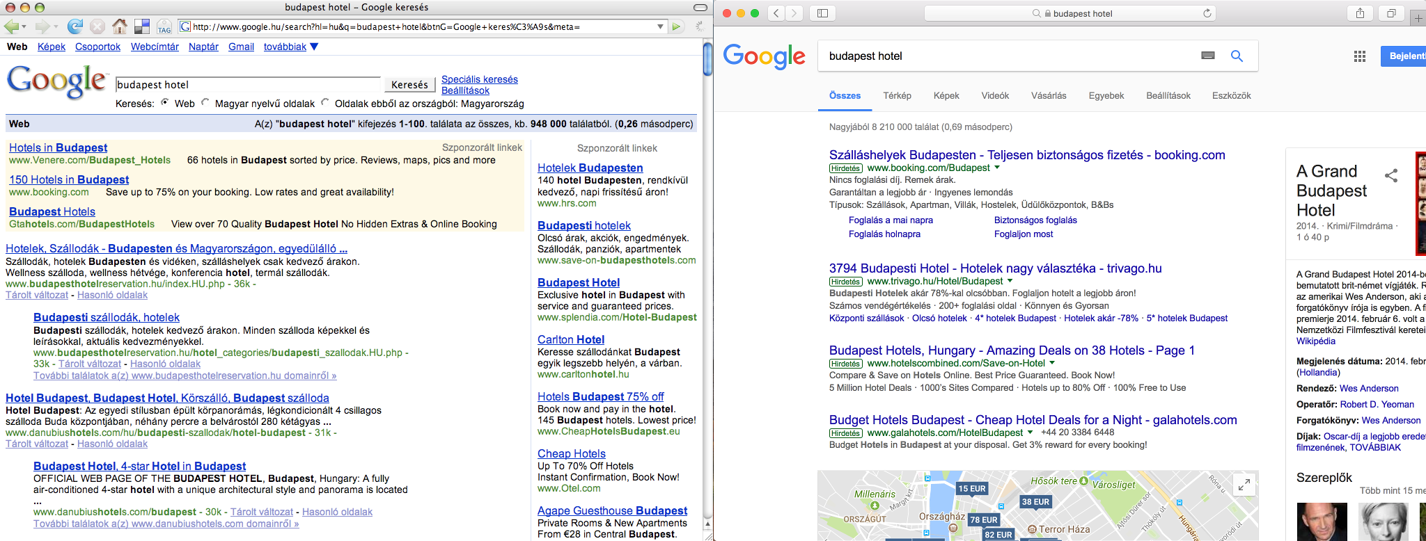
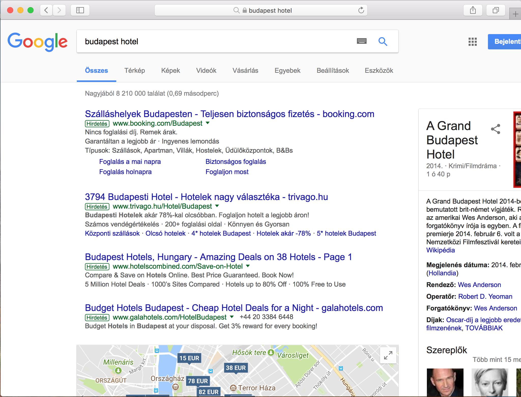
These two screenshots showing the results for the very lucrative keyword combination: ”hotel budapest”, albeit in Hungarian, clearly illustrate how Google’s search engine evolved over the years. While you might spot first some web design related changes, it is more interesting to look behind the surface and discover the substantial changes and tendencies which have a great impact on our daily online marketing activities.

No organic results above the fold

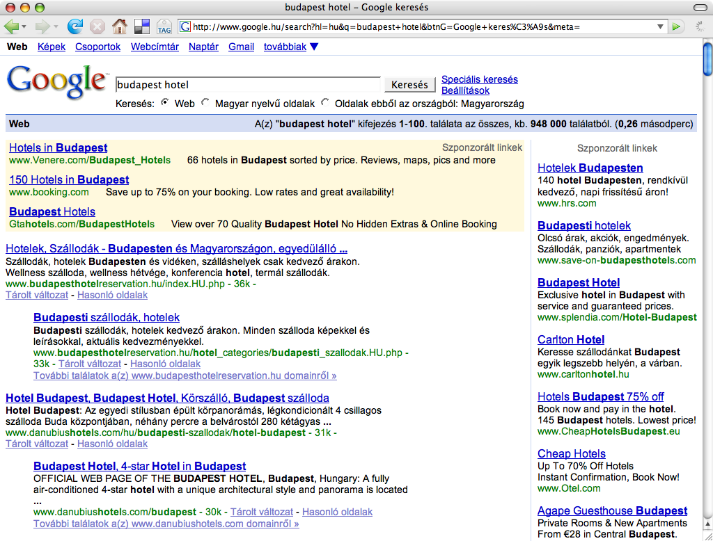
While the old screenshot shows four non-paid search results, occupying almost the half of the screen real estate devoted to displaying results, the more recent screen capture has no ordinary search results above the fold, not even on bigger screens with full HD resolutions.

During those good old days, if you were clever enough, you could get a considerable exposure in Google search results, while nowadays you have to rather rely on paid online campaigns, just because otherwise you cannot bring your message before the eyes of your audience on the most popular web pages. On the above screenshot, you can observe how the paid results, a knowledge panel on the side, and the map-based hotel search interface push down the first organic search results way below the fold. Meanwhile, in the old screenshot below, you can spot non-paid result snippets of an old-school hotel booking/aggregating site and a website of a local hotel aptly named “Hotel Budapest”.

By the way, these webmasters of these first-generation hotel listing/booking pages were among the first ones who were actively doing SEO in Hungary. These sites had been optimized quite frequently by the owner of the property, heavily relying on automated mass link exchange schemes and other, now obsolete, if not counterproductive techniques. They had been wiped out a couple of years ago by a Google algorithm update, way before booking.com and Airbnb started new chapters in the history of online booking.

Google wants to keep users in its walled garden

Although Google’s robots still do not create content, the tendency is clear, just as it was obvious ten years ago too: more and more web content is to be scraped, processed and displayed in a structured format on Google’s own web pages, thus more and more answers are given on the search result pages itself, therefore the content creators are rewarded with fewer and fewer clickthroughs by Google.

You can observe how the hotel offers are listed on a map, how the different prices from the booking portals and the hotel web pages are blended in search results, and how the whole thing is enriched by user reviews and other additional information hosted by the Google My Business service.

It can be easily seen that this ”movement” provides a more seamless experience for the search engine users but also means a lot of drawbacks for the webmasters aiming for getting organic, that is, free traffic from one of the most popular websites of our time.

Conclusion

As big online platforms, such as Google and Facebook, are trying to increase their revenue year by year, less and less free slots are to be available for webmasters, and more and more is to be paid if someone wants to get traffic from these huge sites.

The other phenomenon related also to the constant need of generating more profit is that these online platforms are increasingly capturing others’ content, incorporating them into their services, that is, instead of conveying traffic to the content sources, they will try everything to keep their users close to their ad placements while they consume the third-party contents.

Some more tidbits

It’s also funny to see that while a couple of years ago there was only 948 000 results reported, nowadays there are approximately 8 210 000 results estimated – almost ten times more.

This might be the reason for a ”slower” result generation time: instead of 0,26 seconds, it took almost three times longer, a whopping 0,69 seconds. 🙂

The new results page just does not fit on a 1024 pixel wide screen anymore — a screen resolution commonly used by web designers as the minimum width ten years ago.

The knowledge panel providing in-depth information about a movie titled ”The Grand Budapest Hotel” among the contemporary results indicates that Google is not quite sure about your search intent when you just type ”budapest hotel”. If the big G is not sure what you are looking for, then there might be a considerable amount of search volume for the movie too — in comparison to the volume of the ordinary hotel searches.

I had spent so much time searching for the perfect WordPress theme on ThemeForest, but as I haven’t found one which would 100% reflect what I think about modern websites nowadays, I decided to create my own ultra-minimalist, mobile-first theme and made it available for free.

Why have I created my own WP Theme?

Although the previous WordPress theme I had been using at oldalgazda.hu was quite OK, somehow I didn’t like it 100%, just could not feel that it was ”my way” of building a web site. As oldalgazda.hu have been lately only a hobby project, it was crucial that the site I am tinkering with has a web design I really like, and nevertheless, it is simple enough that I could easily alter it and further develop however I feel like.

During recent years I have come across quite a few innovative and interesting WordPress themes such as Mila or Evolutive, but my biggest problem with these and similar themes that they are just too image-centric: should I eliminate images from the demo content, they just become way less impressive. On the other hand this article about website obesity had a great influence on me, so no matter how I really appreciate JavaScript stuff like Masonry, Isotope, etc., this time I wanted to create something really minimalist for myself: A kind of theme which only adds the absolutely, inevitably necessary amount of code to the actual content, so that I could concentrate on what really matters: the content itself.

What is the essence of my Sixpack WordPress Theme?

  • Ultra-minimalist: As the name indicates, the basic principle of this theme is that there cannot be more than six content items visible on the screen – for the sake of clarity and readability. Of course, more content items can be accessed by scrolling down the page, but the basic rule applies there too: no more than „six packs” of content should be displayed on the screen at the same time.
  • Tile-based: The content items are displayed as tiles. I think Windows’ Metro interface was a great innovation, as only the tiles can provide a consistent appearance independently of screen size.
  • Mobile-first: While developing this on a desktop computer, I was always thinking about how this or that would look on a smaller screen, so when I finished testing the basic stuff on bigger screens,  I just needed a handful of special CSS rules for small screens: mostly for decreasing the number of the simultaneously displayed content items from 6 to 2-3-4.
  • Forcing you to publish the right way: The theme will look at its best if every entry has a short introduction and a featured image, something you will eventually need when you post it anywhere else. Posts and Pages are treated in a very similar way, almost identically listed everywhere (except that for Posts rather categories are shown and for Pages, the page hierarchy is displayed). Instead of defining a header image or a logo for the entire site, you can use sticky posts to display important stuff such as the title and goal of the site, its logo and perhaps a short description.
  • Made for a real site: This theme was made for my own purposes. It has been tested how it works with real content, not just with a bunch of stunning images just to create a nice demo site. I am also planning to develop it in the future to better serve my needs, so you can make sure the theme just works – or will work someday :).

What other features are worth mentioning?

  • No theme settings page: On one hand it is very comfortable for the average web site owner to have a visual dashboard where many parameters of a WordPress theme can be customised, but I find it rather perverted that the web server has to query and calculate with these parameters additionally whenever it is to display a web page. If we are about to change certain variables almost like once in a lifetime, then these values should be hard coded somewhere instead. All in all, go ahead and edit the template if you need to change something.
  • JavaScript-free theme: the theme itself does not load any javascript file, neither contains any embedded JS code. Of course, different plugins might inject their own code, but as far as my theme concerned, you can generate your web pages with only the absolutely necessary amount of HTML and CSS code.
  • No logo, header, sidebar, widget: I don’t like that ”let’s cram these not so important stuff into the footer, sidebar, perhaps one day it might be of someone’s interest” approach, I think it is just a waste of screen real estate, as nobody will read and act on these kinds of additional elements. This is the reason why I have omitted these standard WordPress features from my theme.
  • No navigation menus: in the era of social media sites, it is quite rare if we can make someone browse our web site and read more entries of ours during one website visit, as most of the visitors will just come for a certain piece of content they have seen on a social media or a search result page. This is the reason why I have not built in any conventional navigation menus.
  • Site search pushed back: partly because of the above fact, partly because WordPress search function out-of-the-box is just far from being useful, I did not feel the urge to place an omnipresent search element on each and every web page.
  • Contact us element on search result page: I think it is very important that if someone had searched but could not find the right content, we should give them a helping hand, that is providing an easy way of getting in touch with us to find a specific content: therefore you can easily ask for help in e-mail if you click on a special ”contact us” link, displayed on search result pages if there are no results or just a few of them.
  • Contact us element on 404 not found page: similarly, I think it is very important that the primary goal of these kinds of pages is not to give you an error message but to provide you with everything which could be useful in finding your way on the web site. This is why the 404 page is rather similar to the site map page, also including a shortcut to ask the website owner’s help in an e-mail.
  • Not a general-purpose theme: minimalism and simplification obviously also means a reduced feature set, but as I mentioned the main goal was to create something to serve my blogging needs, so you should add quite a few other visual elements to use this theme for a web shop or a forum.

Other’s work I gratefully used for my theme

Free download of Sixpack WordPress theme